If I close my eyes and focus all my mental energy, I can just about remember taking A-level Sociology. While it may be regarded as a “soft” subject by some, I always found it deeply interesting. One area that intrigued me was semiotics: the study of signs and symbols and their use or interpretation. We’re surrounded by these things and they impact our lives every day, often without us realising it. From the McDonald’s arches to a Christian cross, we see these things and somehow instantly know what they represent. I’m acutely conscious and critical of every piece of design in the world. And that’s what leads us to this review – an unholy fusion of two passions: design and politics.
Politics matters more than anything else. Who is in power in your country will define what liberties its citizens can enjoy. This is especially true in the UK, where there’s no written constitution and, therefore, no pre-defined rights for its citizens. The rights you were born with can be removed at any time and often are.
In the UK, we have a voting system designed to favour a single political party – In England, this is traditionally the Conservatives. In Wales, it favours Labour, and in Scotland, the SNP. The First Past The Post (FPTP) system delivers parliamentary majorities for parties that receive a minority of the vote. While I could easily bang on about much-needed electoral reform (which plays a big part in my pro-bono work), this isn’t the point of this post. But it does mean that if you’re a smaller party hoping to get into power or increase your seats in Parliament, you need all your marketing and campaign material to work especially hard.
I realise absolutely nobody asked for this – but I felt somewhat duty-bound to do it. Once Pandora’s box was opened, I felt compelled to see it through. That said, I’d have liked to have gone into even more detail, but then we’d have been verging on thesis-level detail! I studied Fine Art at University, so it would at least be a first for me if I did.
I decided to focus on three main areas and have given each party a score out of ten:
1. The logo
Arguably, the most crucial element of any party is the logo, which must sum up what a party stands for and clearly communicate it. It should be something that somebody would proudly wear on a baseball cap or pin badge. Not only this, but it should be designed for an array of uses – print, web, social, merch, presentations and, in the case of politics – the voting slip.
2. The website
The website will generally be the first thing a person finds after googling the party name. What are the key messages that are going to be communicated in the first 10 seconds? For most parties, this is also going to be the primary way they can raise funds (via paid memberships). So the website has to do a lot of heavy lifting and should be the lifeblood of the party.
3. Social media
Lastly, I looked at each party’s designs posted to their Txitter channels. Typically, whoever is creating graphics for the party here has a bit more artistic license, but I was also keen to see if there was a sense of consistency in branding or if it was a complete shitshow. In politics, you have your own key messages pre-planned, but there are also a lot of reactions that need to be produced and posted quickly.
TL;DR
If you prefer to listen with your ears rather than read with your eyes, below is a recorded conversation between Rosie and myself. After I’d finished compiling all of the images for this piece, it felt like a good opportunity to have a chat and share our initial thoughts. If you’re interested in a particular party, click through to YouTube. The description contains timestamped chapters for each party.
The Conservatives (aka The Tories)
It’s hard to think of a more oxymoronic name for a political party. The Conservatives were often presented as the party of “traditional values”, and conservatism by its very nature is about slow progress, often in contrast to the liberal ideas of younger generations. It was also always considered the party of business, or at least shareholders. However, Brexit represented the exact opposite of this projected persona. Ever since, the party’s ineptitude has been exposed – along with its betrayal of British businesses, farmers and fishermen (to name but a few). A succession of failed governments have tanked the economy and trashed what was left of that reputation. This is not a partisan view – The UK Labour Party has never held such a dominant lead in the polls, and those in the party are openly resigned to impending expulsion.
With that in mind, let’s look at the party’s logo and how it has changed over the years. Unlike many other parties, the Conservatives haven’t had a consistent identity. Perhaps this is simply because they are an older party, or it could be something deeper.
![]()
Apparently, the current logo is supposed to be a tree. But if I look with fresh eyes… is it? It looks like a biro stain or a Mr.Men character. Maybe Mr Austerity? No, by all objective accounts, this is awful. At least with the previous logos, you could say, “Yes, that’s a torch – ah, it means leading the way”, or the original logo, whilst being very “National Trust” in appearance, at least did what it said on the tin. The squiggle tree, on the other hand… I don’t know what it stands for: old and wise? There’s something particularly ironic about a party part-funded by the oil and gas industry using a tree. I was curious, so I found this article on MarketingWeek from 2006. It seems many party members also hated the design. This should have been an omen for the David Cameron era. Perfect Day, the agency that created the logo has also hidden all mentions of it from their website.
On the flip side, the word art is clean and non-offensive. However, I’d still have expected a serif font to match the “traditionalist” undertones of the Conservative brand. Instead, it looks more like a Barclays bank spinoff. But this could also be the choice of blue, which was lightened during the rebrand.
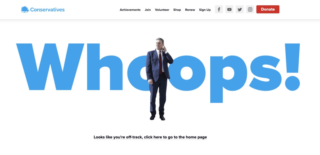
Regarding the website, the hero image is of the current party leader with the heading “Rishi Sunak – Prime Minister” presumably written as a reminder for themselves as much as anyone else. They’ve got a union flag and their “5 priorities”. It’s a bit of an odd website, but not the worst on the list. They do get sassy bonus points for this 404 page though:
As for social media, the designs between posts could be more consistent (you’ll see I’ve written this a lot in this article), although the design quality is better than several other parties on this list. If you took all Conservative branding off of the posts – it wouldn’t be entirely obvious who had produced it. I find this is partly down to a seemingly random selection of fonts. Look at the letter spacing in Labour in the comparison post – yuck! There’s also poor line spacing – see how the y in Only overlaps with the d in and on the line below. Things like this are just so easy to avoid, and I know I’m not the only one who obsesses about these small details.
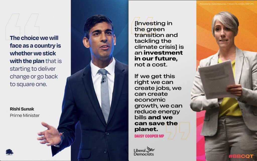
Despite the inconsistencies, I will say there is some design work going into the posts, and they’re not just produced from a Canva account. The big Rishi quotation image is very slick – but what the hell are those massive quotation marks doing – and why only one? Then you have the Network North image, and I want to cut my own eyes out. The copy is terrible; it’s all different sizes and the line spacing is horrible. The Network North logo is nasty – with the bottom letters not lining up with the ones above. The solar flare? Luckily for the Tories, I might be the only one who’s going to remember this post.
Final Scores
Total: 14/30
UK Labour Party
The second biggest party (currently) in the UK parliament is the Labour Party. The name should be a big clue that this is a traditionally left-leaning party with close ties to the UK labour unions. This is also where the party still gets most of its money.
Straight off the bat, I’m going to say that The Labour Party has the most outdated-looking logo of all the parties I reviewed. It also feels like it’s become more dated after every redesign since the Red Flag version in the 80s. One big gripe is that the party’s symbol is an English rose. This seems at odds with a party that has traditionally done better in Scotland and Wales than England. So, is a rose still a valid symbol for a party wishing to govern the whole of the UK as one? Regardless of whether the logo should be a rose – let’s talk about that styling.
The current logo is perhaps one of the worst I have seen, with the rose made up of the negative space inside a red round-cornered square. The rose is accompanied by an anorexic serif font, which I find incredibly ugly. It’s like someone took everything from the Blair-era logo and just made everything more shit. This is the logo of a party not in power. I found this article by Michael Wolff in Design Week about the original Labour rose, and everything he says here is spot on. Especially when he says, “No party in the UK has ever used design effectively”. It’s painful that this is largely still true.
![]()
As an interesting side note, Scottish Labour has had a logo redesign. The old version matched UK Labour and Welsh Labour (yuck), as evidenced in this 2018 Scottish Labour brand guide. I’m not a huge fan of the thistle element, but overall it’s a vast improvement.
Onto Labour’s website and it’s a familiar story: nearly every party we looked at had incredibly dull and uninspiring pages; Labour is no exception. The site has WordPress vibes written all over it and whilst I’m not wowed by it, at least they have gone for a slogan and a bit of content – rather than the more popular “just become a member” strategy that most parties aim for. But, the slogan:
“Let’s get Britain’s future back”.
This word salad is what happens when you ask your team to come up with a Trump-style catchphrase for the left. I get it; Labour is stuck between a rock and a hard place. They need to appeal to everyone – and because of that, everything is watered down. So they get props for pushing a slogan and trying to show what they stand for. But minus points for being so crap at it.
I’d have liked to see something more along the lines of “A Future of Hope” or simply “Britain’s Future”. Both of which are a lot more uplifting and better written. The party has used the latter, but generally as bold text inside the longer sentence. Let’s scrap the extended version.
As for social media, I would say it’s a similar story to the Conservatives. Overall, the design quality is pretty good, but the consistency is all over the place. The tone is also very varied, as you can see. I’ve surprised myself by being a bit on the fence concerning the “F Off” post. Whilst I like to take risks, I still feel this sort of post is better coming from activists rather than directly from the party. Looking at the stats, it received twice as much engagement as other posts and 400% increase in comments (not all of them welcoming). Overall, a bit too much drop shadow for my liking and there’s a real tendency to re-use the same images. I know people’s attention spans are dwindling, but this is still something I’d avoid. Also, someone at Labour knows how quotation marks work, so the Tories should take note there.
For further reference, compare their brand guidelines from 2021 against those of 2024.
Final Scores
Total: 15/30
The SNP (Scottish National Party)
The third biggest party currently in the UK parliament is the SNP. The Nationalists have been the dominant party in Scotland for a decade, seemingly growing in power despite losing a referendum on independence in 2014, or perhaps even because of it. For those who don’t understand the UK, unlike their English counterparts, nationalist parties in Scotland, Wales and N. Ireland are defined by a desire for independence from England. Both Wales and N. Ireland (Ireland) lost their sovereignty through invading forces. However, whilst constantly at war with England, Scotland was arguably sold out by landed nobility. Scots have been fighting to get their sovereignty back ever since (i.e. over the last 300+ years). In case you’re unsure of whether Scotland still holds a bit of a grudge, just look to Flower of Scotland.
So, let’s take a look at their logo…
![]()
The original rune-like logo is supposed to resemble the Scottish flag and a thistle. If you squint, you might get that. When it comes to the newer, softer, rounder version, I’m definitely not getting that; I’m definitely getting noose vibes. Whilst I like the simplicity of it, the semiotics are lost. Over the years, the overall form has rounded. This is probably wise because heavy angular designs are normally associated with fascism. I have the same unease whenever I see the design of the ‘Eryr Gwyn’ flag. I suspect the earlier version was supposed to appear more radical and was ‘softened’ as the party became more mainstream.
The other big no-no for me is the name. I hate initialisms and acronyms when it comes to brands – unless your original name adds nothing to the brand. Take HSBC: the name behind it is ‘Hongkong and Shanghai Banking Corporation’. The full name doesn’t add or communicate anything other than the locations where the bank was started. It doesn’t try to tell me something about what the brand stands for. As where SNP means nothing by itself, you need to learn that the N stands for National etc etc. Contrast this to Alex Salmond’s (former leader of the SNP) party ‘Alba’. Alba is the Gaelic name for Scotland, and the name is accompanied by a logo that’s an inverted Scottish flag. This sort of simplicity is so much more effective from a branding perspective.
So, if you have to shorten your brand to an initialism, you’ve usually failed unless it becomes an acronym. Suppose they were the Scottish National Independence Party. Then, SNIP would be synonymous with cutting itself out of the union. Get it? The only downside is that ‘to get the snip’ means to get a vasectomy, and this sort of association is impossible to avoid. I digress…
The fonts the party has used over time stand out to me. I believe the old version was Supermolot Condensed, whilst the new logo uses Sensibility Black. I really wonder who chose the fonts, as both of those are quite unique.
The SNP have also opted for a WordPress website, so the layout is unsurprisingly formulaic. I like that their first CTA is “Delivering Progress for Scotland – Read our Achievements in Government”. Whether you believe they’ve delivered or not, this is a strong and clear headline. Whilst the website doesn’t wow me, it’s definitely in the better half in this review. Here, they use the same Sensibility font for their H1 titles but Merriweather for the body text. I’m a massive fan of using sans-serif fronts for titles and serif fonts for long-form copy. So they get some bonus points from me there.
It only occurred to me whilst reviewing Plaid’s site that the SNP’s website is only available in English. While I know Gaelic isn’t widely spoken, you would expect a nationalist party to promote the national language. I would also very much love to see the website available in Scots too – everything sounds better in Scots!
When it comes to social media, The SNP are one of the most consistent when it comes to design. They keep many elements the same, and they clearly have some templates they’re utilising. Most of the designs are clean and have bold messaging. In my opinion, it’s some of the best, but the benchmark is very low.
Final Scores
Total: 20/30
The Liberal Democrats
The Lib Dems are a centrist party that has spent the last decade picking off the fleas after getting into bed with The Conservatives (as part of the coalition following the 2010 election). Joining forces with the Tories was political suicide, with many voters left feeling betrayed. The whole episode can be best summed up with then-leader, Nick Clegg’s apology, which, like most things at the time, was autotuned into a song. Honestly, he’d have been better off performing hari kari than this.
Fast-forward to the Brexit era and the Lib Dems came out swinging with their “Bollocks to Brexit” election pledge. I loved this so much – bold, brash and ballsy. You knew where you stood with the Lib Dems… but in the end, people were fed up with Brexit and just wanted to get it over and done with. The party was (unfairly) punished once more at the voting booth. But despite this, the party has found its voice again. After Brexit, Boris’s Covid partying, Liz Truss’s tanking of the economy, and Rishi’s failure to tackle his five pledges, everyone is looking for an alternative. Here, the Lib Dems have been well positioned as a viable alternative, and their performances in council elections and by-elections have been very strong. So the party’s fortunes have turned.
A quick note on the name… “The Liberal Democrats” is a solid enough name. It does what it says on the tin. However, British people are even too lazy to say two words when it comes out as six syllables. So it gets shortened to two: “Lib Dems”. This means that as far as the name goes, it’s a branding failure in my book. The Libby D’s just need a shorter name.
![]()
Onto the logo… “The bird of liberty”. Overall, I like the logo. However, the party seems to have a propensity for using an embossed version, sometimes even with a drop shadow. If it were up to me, I would ban these versions and expunge anyone who disobeys. I would also say that the font used in the accompanying word art is apt – it’s classy without being overly fussy. The kerning also seems pretty good, which can’t be said for everyone. But generally speaking, you can’t go wrong with a bird – whether it’s a symbol of peace or a phoenix rising from the ashes. I will say, though, that I believe there’s still room for improvement. There is something about the shape of the bird and the curviness of it that doesn’t sit right with me. It could be the central shape that makes up the head, body and part of the tail. If you look at it in isolation, it’s not quite right.
Unlike many others, the Lib Dems don’t use WordPress and instead list that the website is built by Prater Raines. It’s unclear why this particular agency was chosen, but they manage several web projects for the party. The layout also follows a common tactic of pairing a large hero image with a CTA to join as a member. I’m not a fan of this method and would prefer parties use this opportunity to tell people what they stand for first. It’s that basic principle of making a good first impression, and this ain’t it.
Lastly, on social media, design-wise, everything is all over the place, and there’s no consistency across any posts. The Lib Dems look their best when using big, bold fonts with bright designs. I know this is something I’m repeating a lot, but I think it’s relevant for all parties. They would do well to create some brand guidelines for social media and try to stick to them. I also noticed they used giant quotation marks just like the Tories, but at least they used the correct amount. Ugh… maybe the Coalition continues amongst the “designers” on Canva?
Lastly, the tagline “For a Fair Deal” leaves me completely cold. What does it even mean? Come on, let’s have a bit more gusto; the Tories are on their knees. Let’s go for the jugular – now isn’t the time to be wet – it’s the time to offer hope and inspiration.
Final Scores
Total: 18/30
That’s the end of Part 1 of this review. Read Part 2 to see how Plaid Cymru, The Green Party, Sinn Féin, The DUP and Reform UK stack up against one another.
You can also see my conclusion and who I think are the biggest winners and losers when it comes to design.