Here is part two of Designing for Power. If you haven’t read Part 1 of the political design review yet, then I highly suggest you start there.
Previously, we looked at the Conservatives, Labour, SNP and Lib Dems. Now it is time to turn our attentions to Plaid Cymru, The Greens, Sinn Féin, the DUP and Reform.
In case you need a reminder, I decided to focus on three main areas and have given each party a score out of ten:
1. The logo
Arguably, the most crucial element of any party is the logo, which must sum up what a party stands for and clearly communicate it. It should be something that somebody would proudly wear on a baseball cap or pin badge. Not only this, but it should be designed for an array of uses – print, web, social, merch, presentations and, in the case of politics – the voting slip.
2. The website
The website will generally be the first thing a person finds after googling the party name. What are the key messages that are going to be communicated in the first 10 seconds? For most parties, this is also going to be the primary way they can raise funds (via paid memberships). So the website has to do a lot of heavy lifting and should be the lifeblood of the party.
3. Social media
Lastly, I looked at each party’s designs posted to their Txitter channels. Typically, whoever is creating graphics for the party here has a bit more artistic license, but I was also keen to see if there was a sense of consistency in branding or if it was a complete shitshow. In politics, you have your own key messages pre-planned, but there are also a lot of reactions that need to be produced and posted quickly.
If you would prefer to listen to this review, a complete audio recording can be found in the introduction of Part 1.
Plaid Cymru
Plaid Cymru, aka ‘The Party of Wales’, are our second nationalist party on this list and are a pro-Welsh language and Welsh-independence party. They are still relatively small and haven’t experienced the same success as the SNP in Scotland. Ironically, this can be attributed to their ties to the regions that are predominantly Welsh-speaking. Most people probably aren’t aware of the history of Wales, how it lost its independence and how the English tried (but failed) to wipe out the Welsh language (Cymraeg). All attempts to kill the language failed, and every effort has been made by the devolved government to increase the number of Welsh speakers. However, whole generations grew up speaking only English, so those people can feel like foreigners in their own country. As is often the case, though, their genuine anguish is often misdirected. Welsh identity is complicated! Cenedl heb iaith, cenedl heb galon.
That said, in recent years, Plaid Cymru has made a lot of effort to spread out and position itself as a party for the whole country. The electorate has yet to fully buy into this, and Labour still enjoys a majority both in the Welsh Parliament, the Senedd (pronounced Senneth) and in the UK parliament in England.
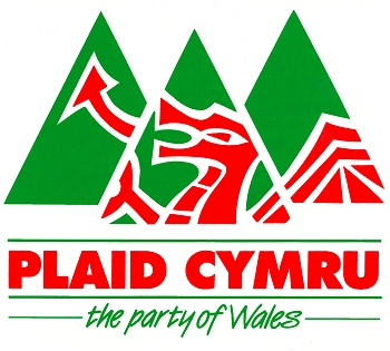
The old logo vs the new. The initial rebrand dropped the word ‘Cymru’ and used only ‘Plaid’ as the name. However, this was soon rectified.
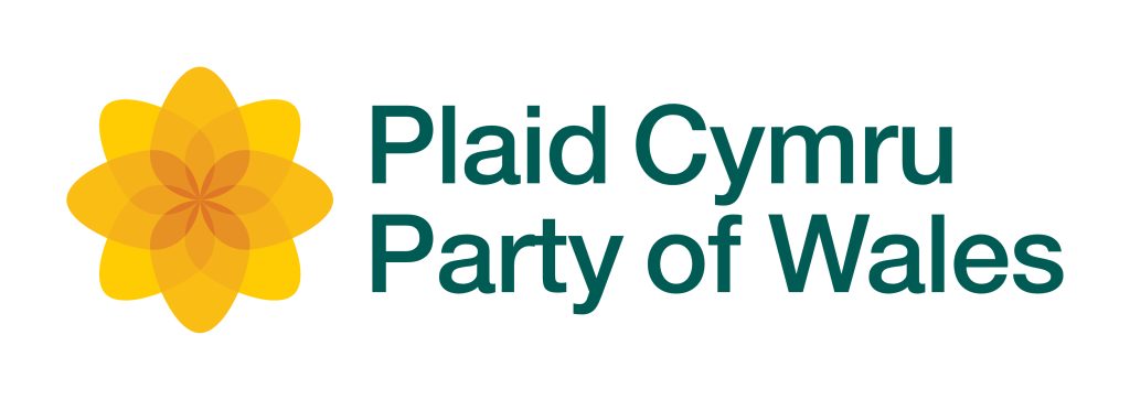
Simply, I think Plaid’s logo is the best of all the parties reviewed here. In 2006, they ditched the dated campsite logo for this clean ‘Welsh poppy’ (which I would have sworn was a daffodil), produced in collaboration with Welsh design agency ‘Departure’. The only downside to this logo is that it’d be somewhat difficult to draw by hand unless you had a Spirograph! But despite this, it still ranks very highly in my opinion. The word art’s font is clean and possibly Neue Helvetica – which wouldn’t be the most original choice, but it’s popular for a reason. I’ve seen a few versions of the word art, and I believe this is the current one. The kerning between the r and the t in Party is irritating me. And if I am being really anal, then the r in Cymru is a bit too far from the m. Small details like that can be quite irksome – surely it’s not supposed to be like that? Using the Web Archive, I was able to find some of the original designs done by the agency, and here, they only use the name Plaid. This might explain why it is the only part of the current design that has consistent spacing. My guess is that a “non-designer” just updated the text with zero care, interest or knowledge of such details. “I think you’re just being lazy”, said in my best Nigel Owens impersonation.
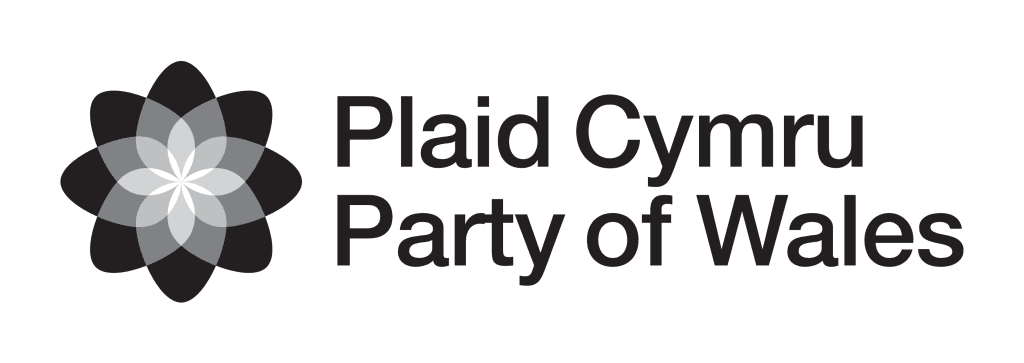
The greyscale version also works well, and I‘ve seen it applied in some instances over coloured images. I’m curious whether the agency had planned for this because if it’s a client invention, it’s actually a good one. The kerning still sucks, mind. Lastly, there’s also this hollow version that pops up from time to time. I actually found a brand book from 2013, and all the kerning is done correctly – this left me very confused – what happened?! Maybe it was a mistake that someone made and nobody noticed?!
When we get to the website, we find that it’s available in both English and Cymraeg. The Welsh URL is plaid.cymru, and the English version is partyof.wales. It’s another detail that I really like. The website itself is built using ‘NationBuilder’, which is a website tool that has been popular with political parties. We’re seeing more parties move away from the platform due to its limited functionality, so it’s interesting that Plaid are still using it. Like the Lib Dems, they have opted for the membership sign-up hero on the homepage with the strapline “Together, we can win a new Wales”. The sub-heading adds, “Plaid Cymru is working towards creating an equal nation and a nation of equals”. That’s some pretty clumsy wording, and to me, it comes across as being too paranoid about being seen as a party for only Welsh speakers. I get the concern, but sometimes it can just lead to crap copywriting.
Overall, I’m not a fan of the website at all, and I am certainly no fan of the membership sign-up-first design. Out of everything, the website is the biggest letdown. When you think about how good the rebrand was, there’s a sense of missed opportunity here.
Things get better as we take a look at the social media designs. It’s not the best, but the designs are bold and clear. There’s a consistency of branding; we can see in the examples below three different logo versions (one colour, two greyscale). I’d prefer some consistency with the spread of the drop shadow, but that is one main gripe. It’s not bad, but it’s still not as clear as the SNP’s.
Final Scores
Total: 22/30
The Green Party
The Green Party of England and Wales is Europe’s least successful Green party. However, this is largely down to the FPTP voting system in the UK, which blocks smaller parties from gaining representation in the Houses of Parliament. In the past decade, the party has increased its vote share by 226%, attaining 2.7% of the vote. However, it still only has one seat in the Houses of Parliament (which is 0.15% of the total share of seats). It only takes some simple maths to expose the corrupt manner in which FPTP denies the votes of millions of people. I’ve personally only lived in safe-seat constituencies for parties I don’t vote for, so in my adult life, no vote in a UK election has ever mattered.
Naturally, the Green Party is like its European counterparts in that it believes in a Green New Deal and prioritises the future of everyone on the planet in the fight against climate change. Of course, in most cases, other parties have looked to the Greens to co-copt their ideas, and you can often hear the Lib Dems and Labour parroting long-held Green initiatives. Ultimately, this isn’t necessarily bad, but it does mean that the Greens have not seen as much electoral success as they might have liked. The party has also evolved to not only focus on environmental issues but also has robust positions on social issues. I believe if/when we see electoral reform, then the Greens will become a liberal powerhouse and are likely to push parties like the Liberal Democrats to be more, ugh, liberal.
![]()
When Rosie and I were discussing the logo on the podcast, it suddenly occurred to me that I wasn’t 100% sure what it represented. I had always thought the logo was the Earth surrounded by petals. But in the discussion, it was suggested that they could be interpreted as flames? Surely not… well, if I don’t know, then I doubt it’s clear for everyone else. Seeing as European parties usually have a sunflower design, I figure the petals are probably the most likely. Regardless of this, I have to say the design is too fussy. As we’ll see with Sinn Fein, using geographical elements in a logo can be challenging. And why does the border not go around the whole planet? Somebody must know, but 99.9% of people will have no idea – myself being one of them.
Interestingly, when I looked back through old designs, a precursor to the Green Party, the PEOPLE party used a hollow green circle. I prefer this simplicity. Some might argue that it doesn’t communicate enough, and they’re probably right. But I still think it is better than what the Greens have now. You know your logo is bad when it’s beaten by a doughnut.
![]()
The word art is one of my favourites. It’s a bold, grotesque font called Manrope with pretty decent kerning as standard. I think the weight works particularly well. If they could simplify their logo, then I believe they could be onto a winner – but at the moment, it’s too fussy. On the name, I would also ditch “Party” and just go with The Greens or even just ‘Greens’
Regarding the website, The Greens are the first on this list to use a video. Who knew political parties were aware of such new-fangled technology?! In fact, they have an interstitial page with the video and a CTA asking you to join, which then takes you through to their NationBuilder website. The video is quite strange because it’s an incoherent series of unrelated video clips of party members. It has more of the feel of a ‘behind-the-scenes’ than a production that grabs your interest instantly. As you progress to the main site, the focus is on joining as a member – not telling you what they stand for so that you feel aligned with their beliefs. Seriously, if they just had someone really pushing the brand and website development, they’d be better positioned to galvanise people.
However, when it comes to social media, they’re up there with the best I’ve seen in this review. The ‘Take back control of water’ is arguably the best overall: clean, green, bold font, consistent branding and a little flourish of design to hide the ‘back’ behind the hill. Okay, this is superfluous, but it’s subtle enough. I was pleased to see that the party is also active on TikTok, and they’re making some amusing and memetastic videos there. Given that younger people better understand the climate crisis and are more likely to be on platforms like TikTok, then this makes a lot of sense. Not huge engagement numbers, but then parties like the Conservatives aren’t even on the platform. I hope they do join – that’s a car crash I’d definitely watch.
Final Scores
Total: 15/30
Sinn Féin
Okay, now we’re onto the Northern Irish parties. I’ve taken the two most prominent parties for this review: Sinn Féin and the DUP. Most people will know Sinn Féin as the (former) political arm of the IRA. For obvious reasons, this held the party back from success in Northern Ireland. That is, until the last election, where the party won a majority – a first for a nationalist party. This shows a growing shift in opinions and is undoubtedly tied to younger generations feeling closer to their Irish neighbours in Europe than the UK per se. It is worth noting that people in Northern Ireland voted to remain in the EU but were forced to leave due to the English voting to leave. This undoubtedly also played a part in Sinn Féin’s recent success.
Sinn Féin’s name is Irish Gaelic and means ‘we ourselves’. As far as names go, this has to be one of my favourites, as it’s the most poetic. It’s also two syllables, so it doesn’t get shortened. But let’s get into the logo… where to start? There isn’t much to like about it. There is a geographically intricate outline of the whole of Ireland, which is overlayed with a negative SF with some rainbow flourishes. Then Ireland itself doesn’t even fully fit into the circle surrounding it. Maybe it’s supposed to mean something, but even if it does, it’s a disaster as far as design goes. A simplified outline of Ireland with SF in the middle without the flourishes would look much cleaner. If I look back through the various iterations of their logo, this current one is certainly the worst. I want to say something more positive about it, but I just can’t.
![]()
As far as the website goes, they, too, push becoming a party member above everything else. They presume everyone knows what they stand for – which is largely fair enough. But younger generations, less affected by the troubles, might want to learn more about the party beyond its history and stance on nationalism. It’s built on WordPress and does have that feel about it. Someone has been enjoying using some plugins to make content move on the page. I think this is the first I’ve seen from all of the parties – website development is not anyone’s forte. It doesn’t add much, but it adds something compared to all the static pages we’ve looked at.
As for the social media posts, it’s a bit of a mixed bag. There’s a sense of a template with the logo appearing on all the posts I looked at. However, from what I can see, there’s no consistency of colours and fonts. Also, someone has used a drop shadow even when the text is against a solid background. This is a heinous crime. I know I said I was only judging Txitter content, but the party is pretty massive on TikTok. They’re not funny like The Greens, though – it’s just clips from the Dáil Éireann (Lower house of the Irish parliament / Oireachtas). But they are getting a lot of views!
Final Scores
Total: 11/30
DUP (Democratic Unionist Party)
The DUP are arguably one of the most regressive parties in the British Isles, with a seat in the UK parliament. Most recently, they became known for tanking the Northern Irish legislature after losing to Sinn Féin for the first time in local elections. Stormont (The Northern Ireland Assembly) has only shut down eight times, meaning that it has only operated for 60% of the time since opening. The previous time the parliament collapsed was because of Sinn Féin (although for more legitimate reasons).
Anyway, the DUP only just backed down, but only after two years of complaining about the Northern Ireland protocol – a Brexit provision they not only agreed to but were paid to agree to. For those who don’t know, the DUP is both unionist (they’re passionate about being in the United Kingdom and are relatively alone in this passion) and loyalist – a form of ethnic nationalism relating to Protestantism. If you want to know why, then you’re going to have to read up on the history of Ireland! Maybe even check out Fintan O’Toole’s We Don’t Know Ourselves for a recounting of the modern era.
The logo is a big bold italic DUP, with what I guess is a lion plonked on the corner. Certainly, the lion appears to be modelled on a Lion from Trafalgar Square. But it’s pretty ugly. The colours are, of course, those of the Union flag, but it’s unclear why some parts of the lion have been made red – like the mohawk. Okay, we have another initialism, which I’ve already said I hate. Then the lion is stuck on the side… is the DUP supposed to be the lion’s body with the P a luscious booty? It’s not clear. The Lion isn’t a closed design, so it must always be used without a fill. This feels like the sort of thing designers fear the most.
![]()
The website’s URL is MyDUP, as though it’s the MySpace of Ulster Unionists. Sadly, it seems someone in America is squatting on dup.com. Now, I have to be honest in that I think the DUP has one of the better websites, if not the best. There’s nothing extraordinary about it at all, but it’s very well laid out and wins in its simplicity. You’ve got your membership sign-up options (of course), but there is also a clear heading, “Moving Forwards Together”, along with their rendition of the 5-point plan (the latest political trend). Interestingly, I couldn’t instantly see what platform their website is built on, only that they use Sheep CRM – a CRM tool I had not previously heard of. After a little bit more digging, I was able to see that they use a CMS called Craft CMS. Again, this was a CMS I hadn’t personally come across before. DUP – you mysterious strangers.
As for social media, the only good thing is that they use a lot of large bold, san-serif fonts. Generally, this works well for getting across political messaging. However, there’s zero consistency across the smorgasbord of content. Seriously, the messages are all over the place, the font weights are equally scattered, and the English used is quite poor. The DUP is also on TikTok, which surprised me a lot. But they have hardly any followers and little content.
Final Scores
Total: 14/30
Reform UK (Formerly known as The Brexit Party)
I genuinely nearly forgot to include Reform, despite having talked about them on the podcast and already done all the clippings of their logo, website and social. If you are under the age of 70, then it is easy to forget they exist. Even though Reform UK don’t have a single MP in parliament (currently), I decided to include them as they still play a part in British politics and could even dethrone a few Tories in the next election.
Before the UK left the European Union, they were called ‘The Brexit Party’. This was a party set up by Nigel Farage after falling out of favour with the previous Brexit project: UKIP. The party has never been particularly serious about taking power, but more so in acting as a tool to bully a divided Conservative party. In this way, the party has been incredibly effective – forcing David Cameron (former Prime Minister) to hold a referendum on staying in the EU to keep his party together. A referendum that none of the public actually wanted – only 1% of the public was concerned with being in the EU. After Brexit, the party decided to rebrand or at least keep the same branding but change the name. Reform UK was born. They are pretty light on substantial policies, although I think the only thing they do want, which I agree with, is electoral reform. Without a doubt, they’d be able to send some of their most annoying people to Westminster, just as they did in the EU elections when we still had them.
![]()
![]()
There isn’t much to the Reform UK logo. It’s a white arrow in a turquoise circle. The arrow is pointing to the right. This is either to indicate that the party is right-wing (I jest), or it could be seen as an arrow pointing back at Europe, like the ones seen at the beginning of Dad’s Army. It should probably point in the other direction, as the UK runs away from Europe. Turquoise is also an interesting pick for a right-wing party. They’ve done well to find a colour nobody else has chosen, but it doesn’t fit the English Nationalism (bad kind of nationalism) that the party is associated with. I’d also love to know what happened to the end of the arrow between redesigns. The party has employed the Helvetica font in not one but two weights. I guess they felt this was modern and trendy. Don’t get me wrong, there is nothing wrong with Helvetica at all, but it’s the one you would reach for without any interest in design or exploring other options. Compare this to several parties who use fonts I hadn’t previously come across.
The website looks as you would imagine it. Here, we’re introduced to the two catchphrases, “Let’s Make Britain Great” – I wonder where they got the idea from? Also, note that they don’t want to make it Great Again, thus indicating it was never great – an odd proposition for an isolationist party that plays heavily on nostalgia. And then, in tiny writing (too small for most of their supporters to read), it says, “Let’s Save Britain”.
Reform has gone for a 4-point plan. Either they wanted to be succinct, or they can only count to four.
- Try what Liz Truss did with unfunded tax cuts and tank the economy.
- Put a stop to net zero targets, but also embrace socialism and part-nationalise the energy industry (Yeah, this one is surprising – although nationalisation is pretty popular across the political spectrum these days).
- End NHS waiting lists and have police catch criminals. How do they plan to do that post-point 1?
- They want political reform, which is indeed needed. But they also mix in their hatred of the civil service (who they would need to do anything) and the BBC (because it’s not more racist).
Lastly, let’s take a look at their social posts. It’s a bit like with the DUP; they’ve gone for the scattergun approach. Now, they do include their logo on many of their posts and honestly, the designs are much better than I expected. I did chuckle at their “The End is Nigh” pun of “STARMERGEDDON”. Sadly, the design of that post was pretty poor. If you’re a British person, you are brought up to love puns, so perhaps I enjoyed it more than I should have. Still, the proposition is pretty silly. STAR-MEH-GEDDON more like.
Final Scores
Total: 12/30
Conclusion and final scores
This was quite a mammoth task, and I honestly didn’t go into as much detail as I would have liked. I could really geek out on some of the kerning details I discussed, and perhaps I’ll write a separate post just on this topic that only hardcore type-geeks will read. I also felt compelled to work on my own redesigns of the party logos – but that would likely only end badly, should I do a good enough job.
Below, you can find the whole table of my ratings. I’d be interested to hear from anyone who has any significant disagreements. This is, after all, only my interpretation. I’ve tried focusing on the design and branding elements and avoiding bias when scoring. I’m sure there was some bias, but some of my preferred parties didn’t score that highly in some key areas. Instead, I did try to allow myself to be surprised when a party did better or worse than I expected.
The winners and losers
The outright winner of this review is Plaid Cymru. It shows what a decent redesign can do because if I’d been judging their old logo, I would have rated it a one: the exact opposite end of the spectrum to what they ended up with. The more I dug into old branding manuals, the more impressed I was.
Sinn Féin came last, which surprised me as I had expected them to do better. Whenever I have heard their leaders talk, I’ve been primarily impressed with their professionalism. As someone who cares maybe too much about design, I would highly recommend the party to rebrand – especially now that they are the biggest party on both sides of the Irish border.
Despite the scoring, the real loser out of all the parties is Labour. They are the second biggest party in the UK at the time of writing but have the joint-worst logo. I mean, I just hate everything about it – it’s ugly and dated. If there is one party I think needs to rebrand, it’s them.
Lastly, I think The Greens have the most potential as a party, but they need to rebrand in the same manner as Plaid did. I know they don’t have the same budgets as some of the bigger parties, but they should consider it.
So there you have it—the Howell & Howell design review of (nearly) all the UK’s political parties. I was going to ponder whether we would see any rebrands before the 2024 General Election, but as a snap election was called earlier than expected, I think that is unlikely now. However, I am expecting an aggressive campaign, so keep an eye out for some zingy one-liners, if nothing else.
PS: Bonus mention to the failed Prime Minister Liz Truss, who already posted an election post on social media in which she utilised the old Thatcherite version of the Conservative logo! The game is afoot!